LOCATIONS
Hong Kong
-
Facebook
-
LinkedIn
-
Instagram
-
Youtube
We all have our strengths and weaknesses, but you don’t have to be art-savvy to create good design. When it comes down to it, aesthetically-pleasing design is not unlike an algorithm, especially in the context of Marketing. It's all about understanding what is visually pleasing, and apply these principles throughout. Aside from the resources we shared in a previous post, the below tips will get beginners on their way to introducing some appealing elements into their design, bringing their skills to the next level. If you want to see more design-related content, be sure to comment below to let us know!
Before you start designing away, the first thing to consider is intent. Who are you designing for? What message do you want to communicate? What's the simplest way to do so? The key lies in keeping your design straightforward, as effective design is one that does the job in the most direct way possible while being compelling. Easier said than done, but planning things out before you dive in will help.
It goes without saying that typography is one of the most important parts of effective design in not only relaying the primary message, but to help evoke the overall feeling of the visual. Playing around with the size, weight, kerning, and font of your typeface creates contrast, and elevates the overall look. Also, it works to create hierarchy, which is an essential consideration, as it affects where the viewer's eyes are drawn to first.
The flat design trend isn’t going away anytime soon, but it doesn’t mean that Drop Shadow has to live in its...well, shadow. A very subtle Drop Shadow can do wonders to create dimension in your design. The key to making it work is adjust its distance from the object so it doesn't look too overt or overpower the text. In fact, it should be so subtle that the viewer barely notices it.
Texture is another element that makes your design look more polished. Again, the general rule is to keep it subtle and consistent throughout. If you have a barebones design, applying a texture, pattern, or filter and do wonders to make it look more sophisticated. Subtle gradients on your text or background can also help create dimension, and spice up an otherwise boring look.
Alignment and spacing are two of the most important aspects of design. While being able to organise your design in a spatially balanced way takes practice to perfect, the general rule is to make sure alignment (i.e. left, right, centred) is consistent, and the spacing is balanced (e.g. margins are even). If it helps, you can use boxes or lines between text to create more hierarchy and structure.
The general rule when it comes to using colour is to stick to two primary colours in your design, and up to three secondary colours. This helps to ensure that your design isn’t too busy, and the content can easily be discerned. It’s also helpful to visualise the how to use bright versus neutral colours to draw the viewer to a certain message.
 Garage Blog
Introducing Garage Society's Newest Premium Workspace at Tower 535 Causeway Bay
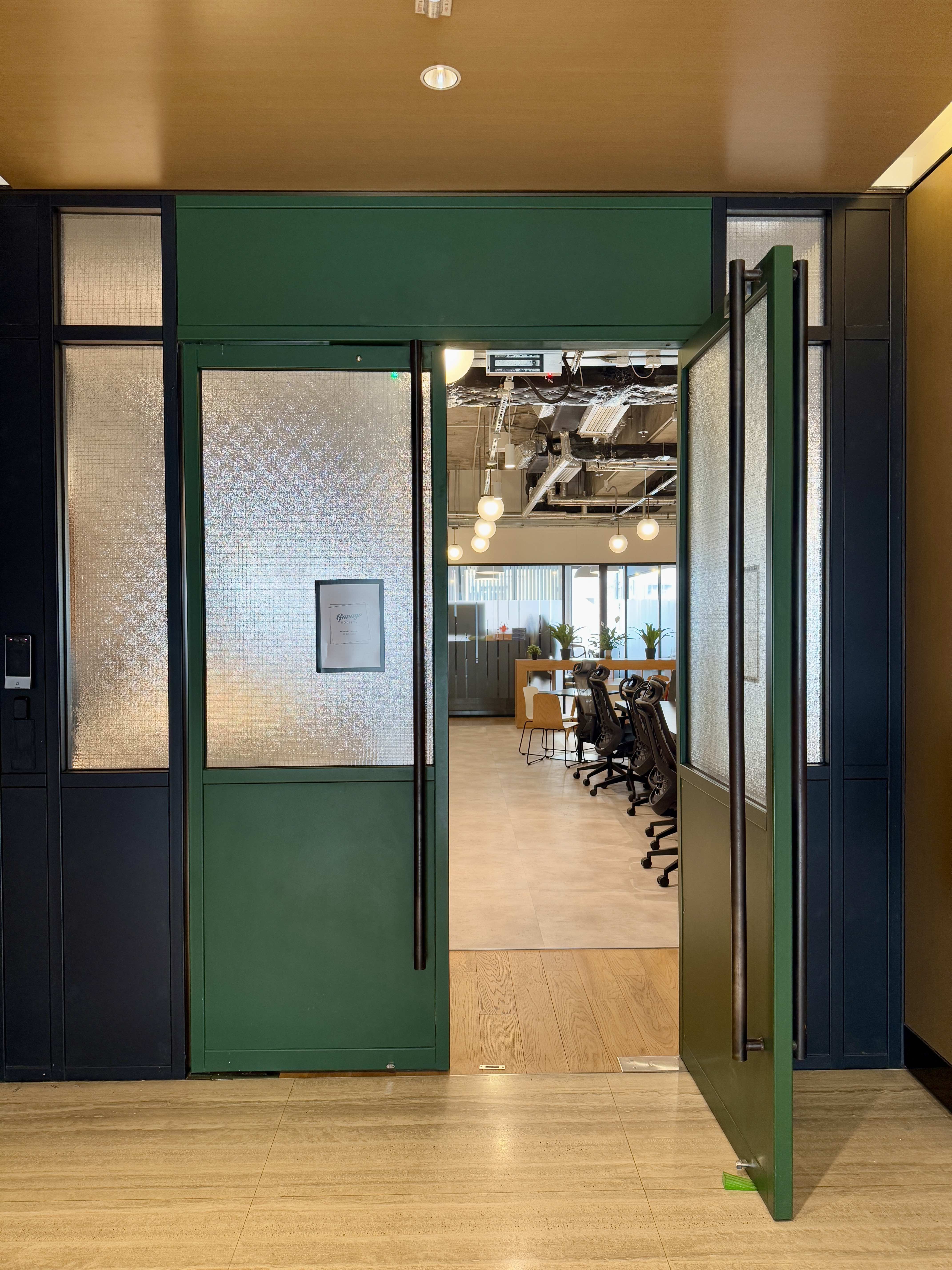
We're thrilled to announce the opening of our newest Garage Society location in the heart of Hong Kong's most dynamic business district!
Garage Society Causeway Bay brings our signature blend of community, innovation, and premium workspace to Causeway Bay's prestigious commercial hub.
 Garage Blog
From Flat White to Flexspace - The Best Coffee Spots Near Garage Society Locations
Looking for the perfect cup of coffee to fuel your workday?
Members enjoy free coffee 24/7 in our spaces, but sometimes they need a change of scenery (or bean!). That's why we've compiled this guide to our members favourite independent coffee shops near each Garage Society location!
Whether you're a dedicated hot desk member or just exploring flexible workspace options, stay caffeinated and inspired with our picks below: